Ad tech company Choozle has a team building game called Choozle Crews, where the entire company is divided into four teams—spring, summer, fall, and winter—and they compete throughout the year by gaining points. A logo was created for each, and specifically for spring, they decided on the name “Killa Bees” as a representation of spring flowers and the crucial role that bees play with the environment. Without wanting to show just a bee, the concept of a strong, sharp samurai evolved, with intricate details that all tie back to spring, and the sting of a bee.
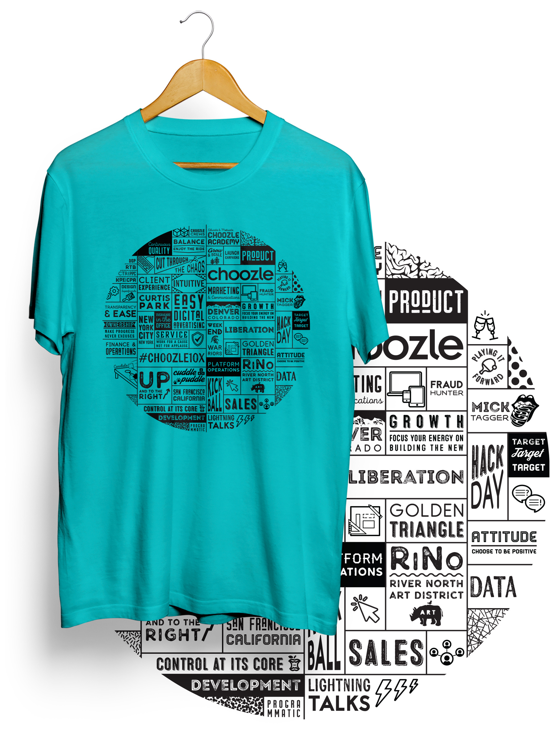
In addition, Choozle hosts a summer and winter summit every year, and a new shirt design was in need. I created a simple and playful typographic graphic, which featured elements of Choozle’s product, structure, culture, as well as some inside jokes.
Core Responsibilities: Logo Design, T-Shirt Design, Flag Design


©2026 Erin Shimamoto Resume LinkedIn